


Case study YOUDROOP
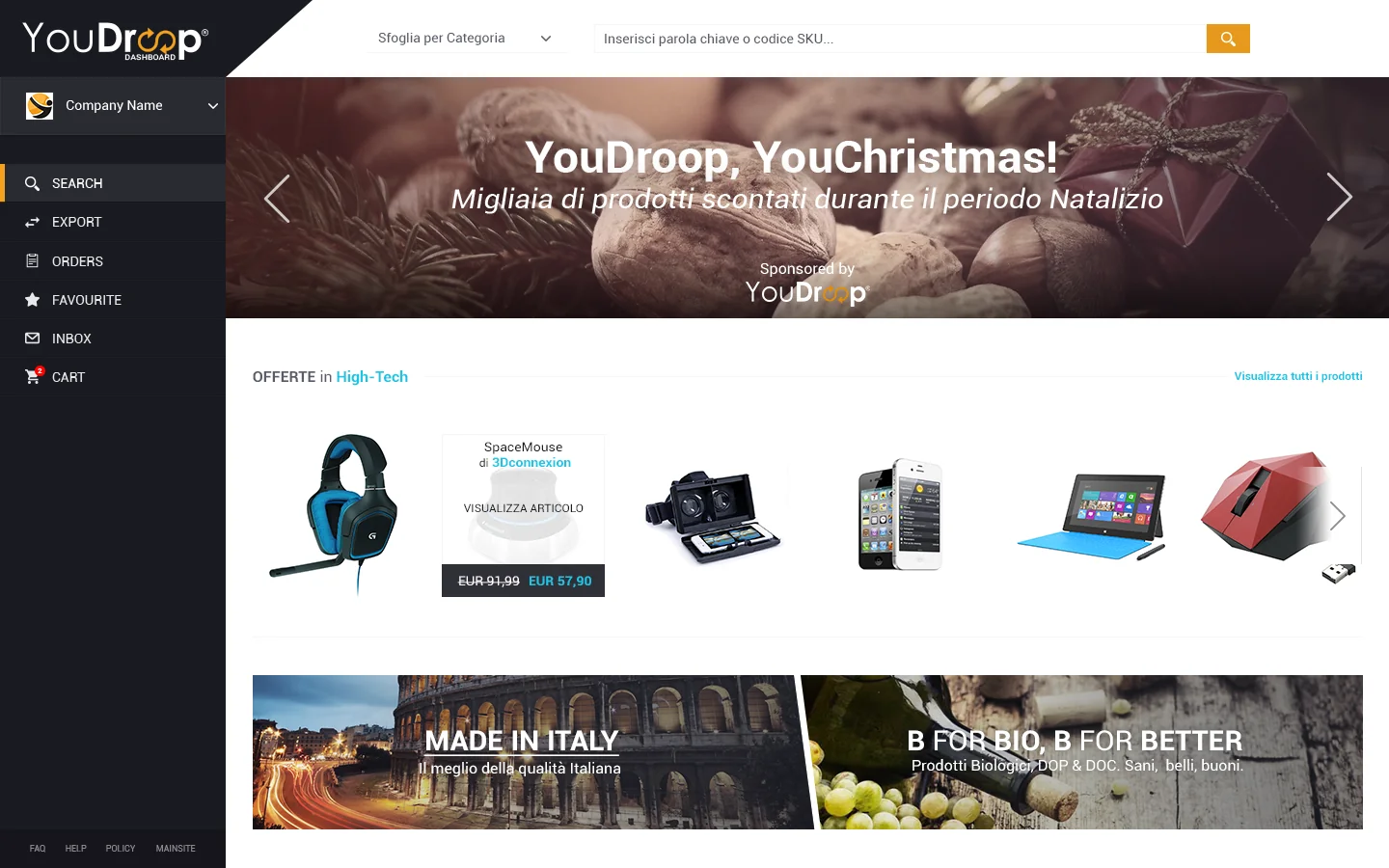
YouDroop is the Italian B2B dropshipping marketplace, incubated at I3P (Politecnico di Torino). When the team (six people across development and business, no designer) reached out, they already had real customers and interested investors. What was missing was the layer that turns a working technology into a usable product. We designed the interface that brought YouDroop to market.

From a platform idea to a real product
YouDroop had existed since 2015 as a Turin-based company incubated at I3P, the innovation incubator of Politecnico di Torino. It was built on a specific B2B market intuition: Italian dropshipping. The model connects suppliers with catalog and logistics capacity to online resellers who want to sell without holding inventory. A mechanism already established abroad but with few structured players in Italy.
When the team reached out, it was four people between development and business. No designer. They had built the first technical version of the platform, signed contracts with their first real suppliers, and received interest from investors for an equity crowdfunding campaign. What was missing was the layer that separates a working system from a product people actually use.
The engagement was end-to-end over a six-month window: information architecture, flow design, UI, design system, institutional website for go-to-market. Direct coordination with CTO and CEO, no intermediaries, no structured process. Biweekly review cycles, iterative delivery.
Two opposite users, one interface
A B2B marketplace lives in a structural tension: two opposite user types coexist on the same platform with needs that often contradict each other.
Both share one need: the tool must work without asking them to think about it. Every minute spent figuring out how to do something is a minute taken from their business.
Make technical complexity invisible
Make technical complexity invisible, and only the user benefit visible.
This principle guided every design choice. The complexity was real: integrations with external systems, asynchronous order management on two sides, cross-actor notifications. But it never had to become the user’s problem.
Information architecture
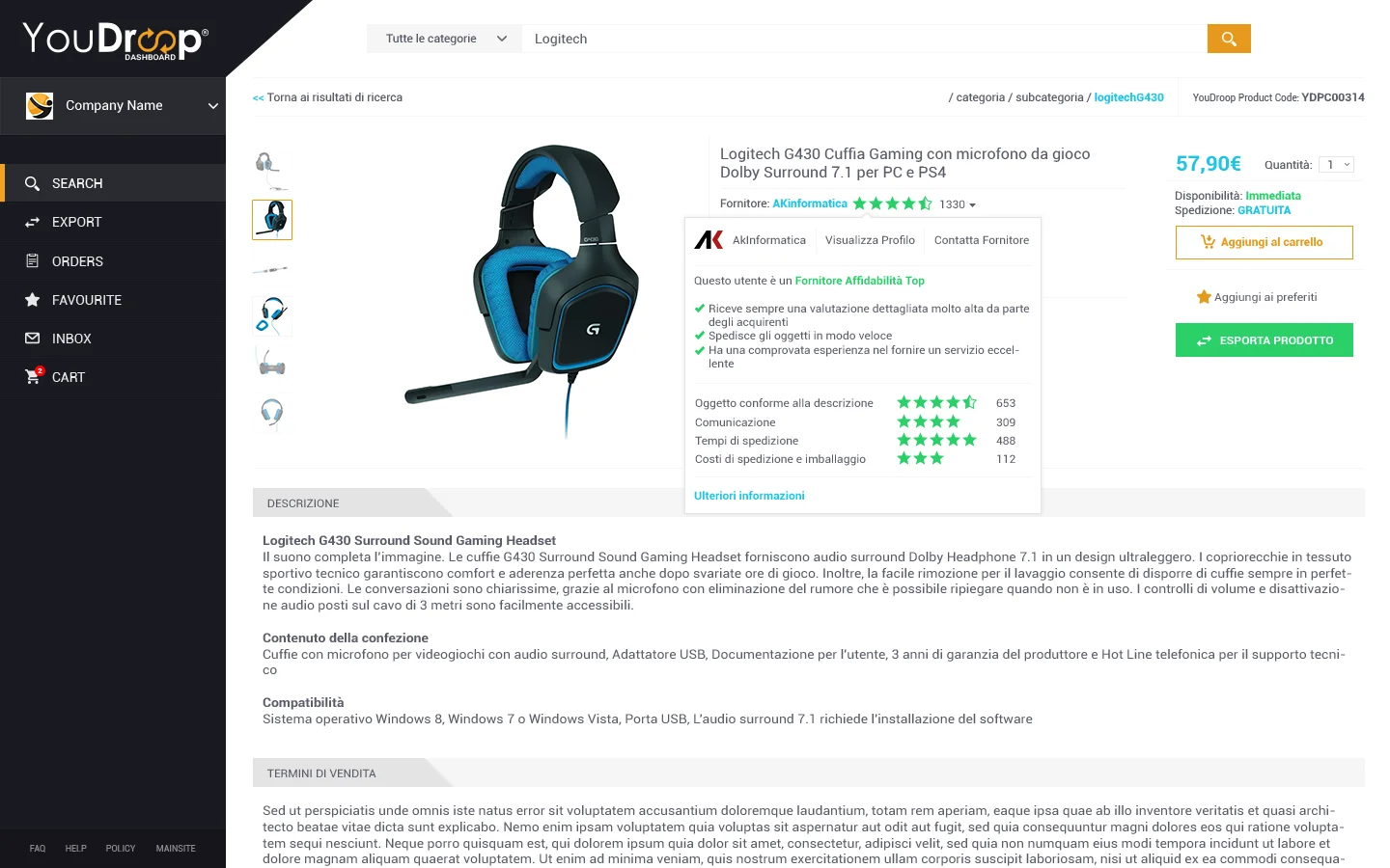
The platform had four main entities: users, products, orders, notifications. Plus a fifth transversal one: settings (account, payments, integrations). On this structure, the differentiated paths between supplier and reseller were built.
The result is a persistent side navigation, with a light top bar for search, notifications, and account. No secondary dropdowns. Hierarchy always visible.
Onboarding wizards: two distinct paths, same pattern
Onboarding is the moment when a user decides whether they’ll keep using a product or abandon it. On a B2B marketplace with two opposite user types, two distinct wizards were inevitable. But building them with two different patterns would have been expensive and incoherent.
We unified the pattern and differentiated the content. The supplier wizard covered registration, VAT verification, catalog upload, shipping configuration, payment system connection. The reseller wizard covered registration, VAT verification, sector selection, external store connection.
Same layout, same progress bar, same incremental save logic. Users could exit and return without losing state. Same linguistic tone. Different content, validations, error states.
Notifications and orders: visible state, invisible modals
A YouDroop order goes through four active states (requested, accepted, shipped, delivered) and involves three actors (reseller, platform, supplier). Each state change potentially generates required actions on one of the three.
The risk was building an aggressive notification system (pop-ups, modals, badges everywhere) that would have grabbed attention at the cost of noise. The choice was the opposite: centralized notifications, state always visible on relevant pages, modals used only for actions requiring explicit confirmation before an irreversible operation.
In practice: order list with state as a column, dashboard with counter of orders requiring action, email notifications for significant state changes, no audio alerts, no permanent red badge.
The institutional website: the visible promise
The public site is the first contact. For a B2B marketplace, it’s the moment when a potential supplier or reseller decides whether registering is worth it. It had to keep two contradictory promises: communicate professionalism and reliability (for suppliers, who entrust their catalog) and readability and speed (for resellers, who decide in seconds).
The design respected coherence with the platform: same palette, same shapes, same typography. Whoever arrived from the site to the platform didn’t have the feeling of entering a different product.
Going to market with a real product
With platform and site live, YouDroop entered the market seriously. It raised capital through Club Italia Investimenti and subsequent equity crowdfunding campaigns. EU-Startups included it among the ten most interesting Italian startups of 2017. The project was presented at SMAU and covered by the industry press.
Design wasn’t the only factor. There was the platform’s technical quality, the market intuition, the team’s commercial execution. But it was the layer that allowed everything else to emerge. A B2B platform without a coherent UX doesn’t sell, no matter how robust it is under the hood.
Numbers
Top 10
Italian Startups to Watch
EU-Startups, 2017
I3P
Incubation
Politecnico di Torino
6 months
Design delivery
End-to-end, iterative

Have a similar project?
Let’s talk about the next project.
Performance & Interaction Design Studio. Every client followed personally, from brief to delivery.