



Case study EPICURA
EpiCura is the Turin-based startup that brings physiotherapy, osteopathy and home healthcare services to people who can't or won't travel for them. When the founders reached out, they had no designer, with a temporary mini-site and the first patients already on the books. The constraint was the target: elderly people, people with reduced mobility, used to the phone and not the web. We designed the platform that brought EpiCura to market.
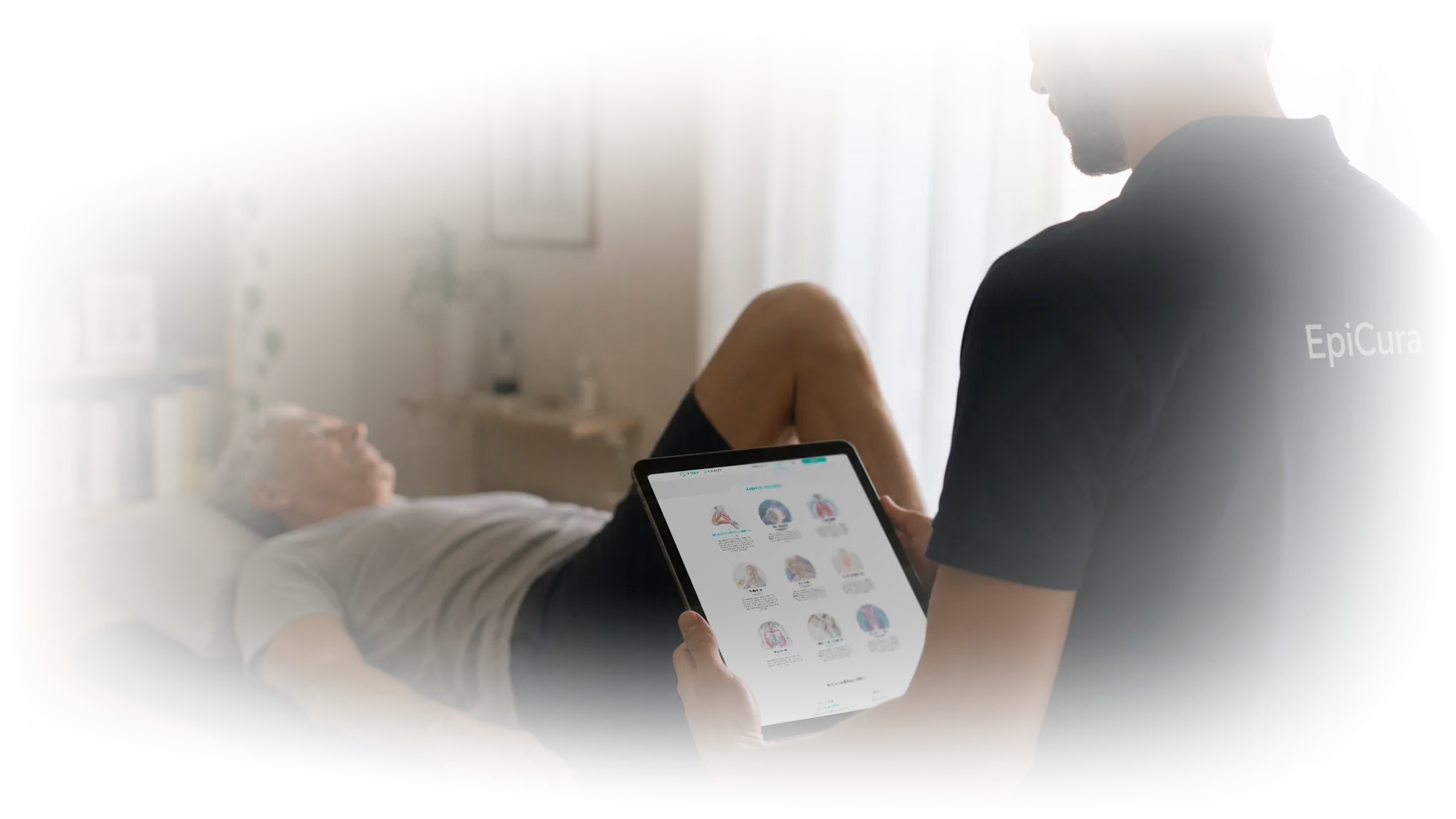
From a three-person startup to a real healthcare service
EpiCura was founded in Turin in 2017, incubated at I3P (Politecnico di Torino) and accelerated by SocialFare in the Foundamenta#3 program. The idea: a digital platform for home physiotherapy and osteopathy, connecting certified professionals to patients in less than 24 hours.
When the founders reached out, they were three people: between business and development, no designer. They had a temporary mini-site and the first patients already on the books, handled manually. To enter the market seriously, two things were needed: a real platform managing booking, payment and service delivery, and a digital identity that presented the service with the clarity it deserved.
The engagement was end-to-end: architecture, patient and professional flows, UI, design system, institutional website, management dashboard. Direct coordination with the founders, weekly review cycles, iterative delivery.
The target that isn't digital
The key was the audience. Home physiotherapy responds to a real need of those who can’t easily move: elderly patients, people with reduced mobility, families caring for an aging parent.
This means a target with often low tech familiarity, booking habits tied to the phone, little patience for interfaces that require learning something new. The product couldn’t be “the usual booking site” nor “an app designed for millennials”. It had to be usable by people who rarely click, by people who struggle to read their phone screen, by people who don’t want to create an account but only want to book a visit.
Designing for people who don't want to learn
The principle wasn’t “simplify”, which often leads to infantilized interfaces. It was “require no learning”: every screen had to be understandable on first visit.
The booking flow: few choices, natural sequence
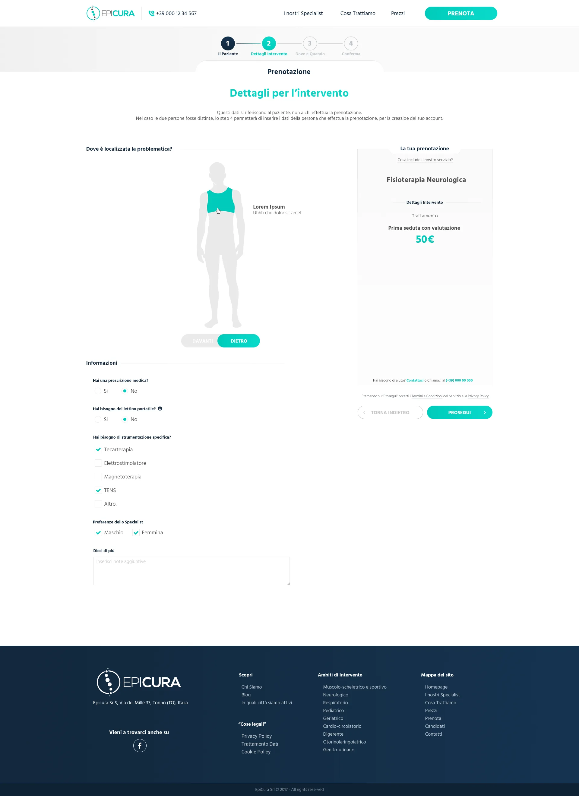
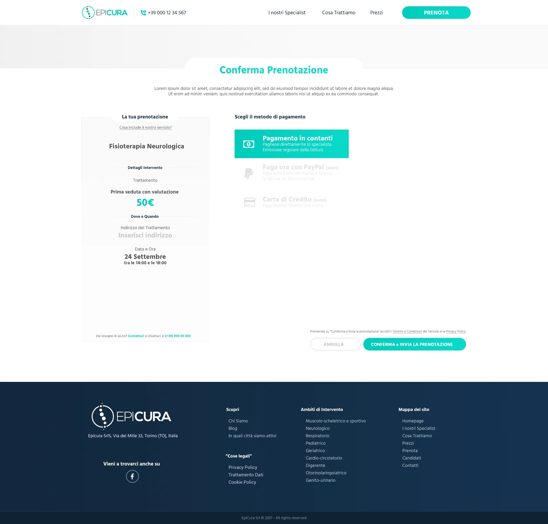
The booking flow was the heart of the product. The constraint was dual: it had to be walkable by people who don’t click every day, but it also had to collect all the information needed for a healthcare service (minimal medical history, patient contacts, address, time, payment method).
The solution was breaking the flow into micro-moments: each screen asks one thing, shows what was already chosen, indicates what comes next. The sequence follows the logic of a phone booking call: type of visit, urgency, where and when, contacts, confirmation.
No small hidden progress bar. A clear visible scan, with completed steps checked and upcoming ones waiting. The patient always knows where they are.
Patient data, essentials only
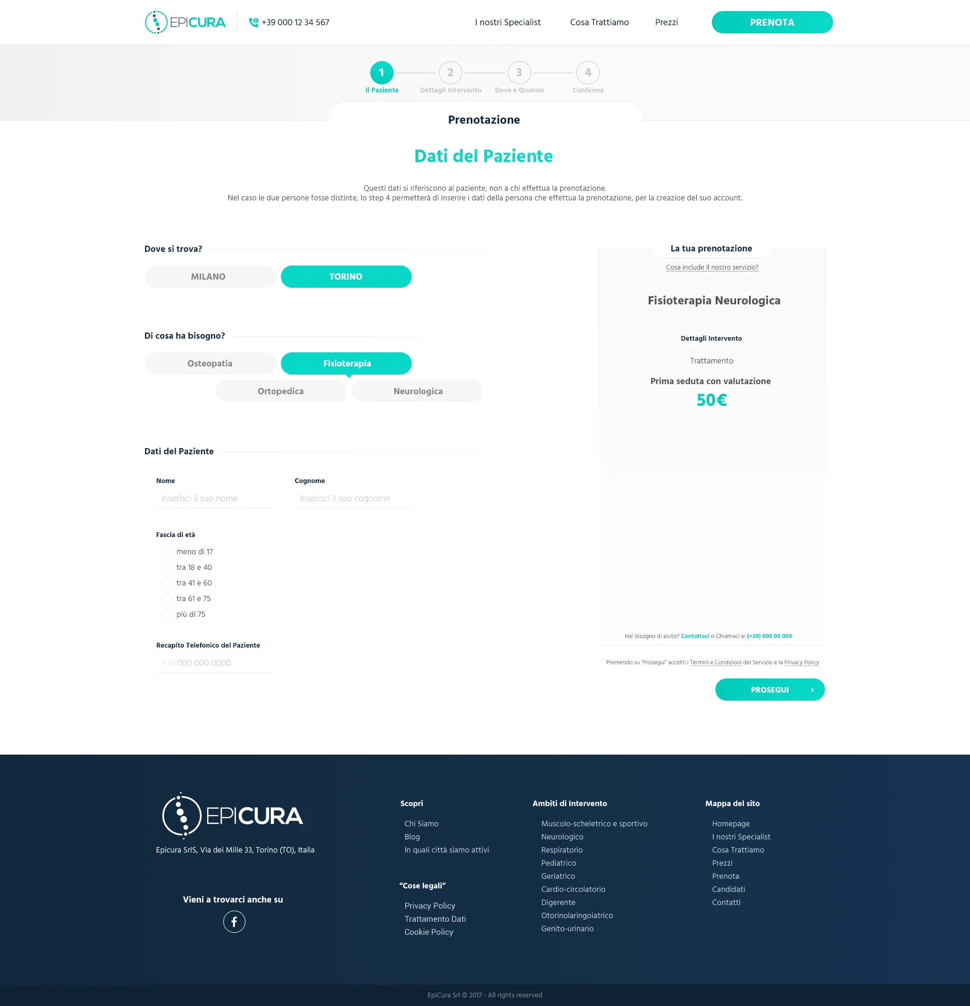
For a healthcare service you need patient registration. With a non-digital target, a fifteen-field form is where users drop off.
Booking Step 1 collects only the essentials: city, treatment type, first name, last name, age bracket, phone. No medical anamnesis is asked before booking. That data comes later, contextual to the visit type. The form is short, readable, finishable in two minutes even for slow typists.
The specialist side: joining the network
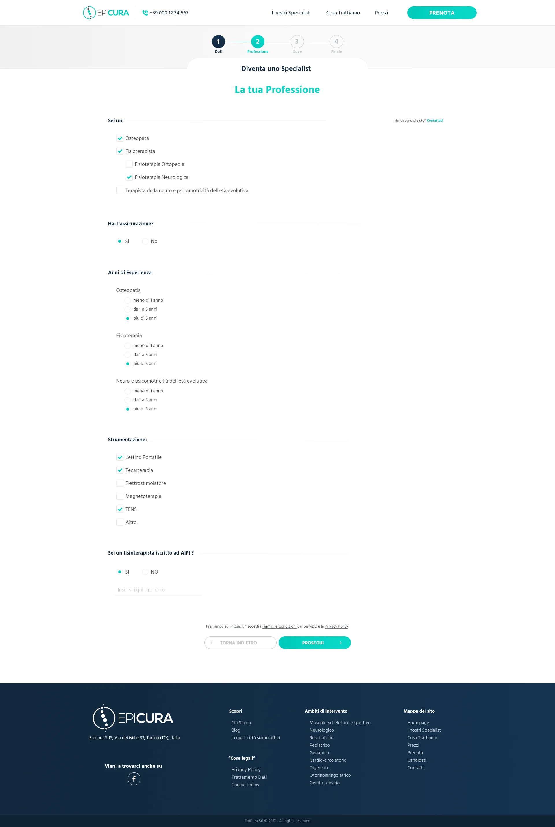
On the other side of the platform were the certified professionals: physiotherapists, osteopaths. To build the network, an equally careful onboarding was needed: who’s applying, with which specialization, in which city, with which equipment, with how many years of experience.
The specialist application flow was designed in four steps: personal data, profession and skills, operating areas, document upload. Each step collects what’s needed to match with patients, no useless bureaucracy. Once submitted, the EpiCura team contacted the professional for an interview. The profile, once approved, became the public shopfront in the network.
The institutional website: saying clearly what you do and for whom
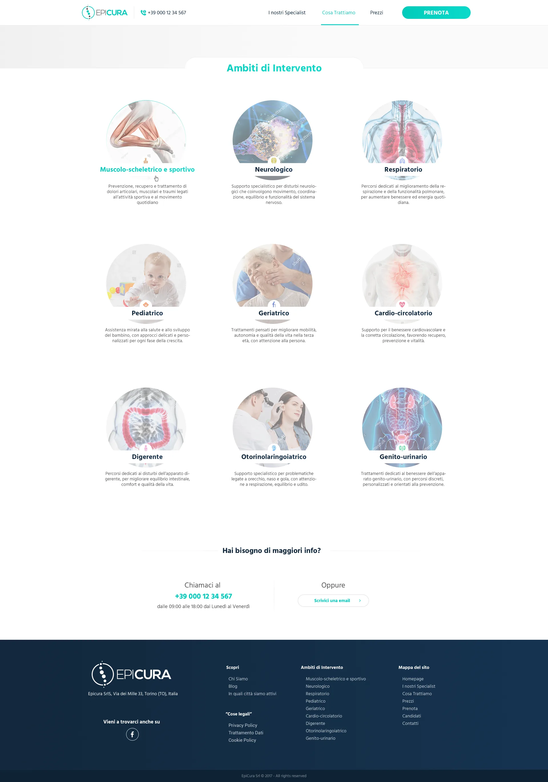
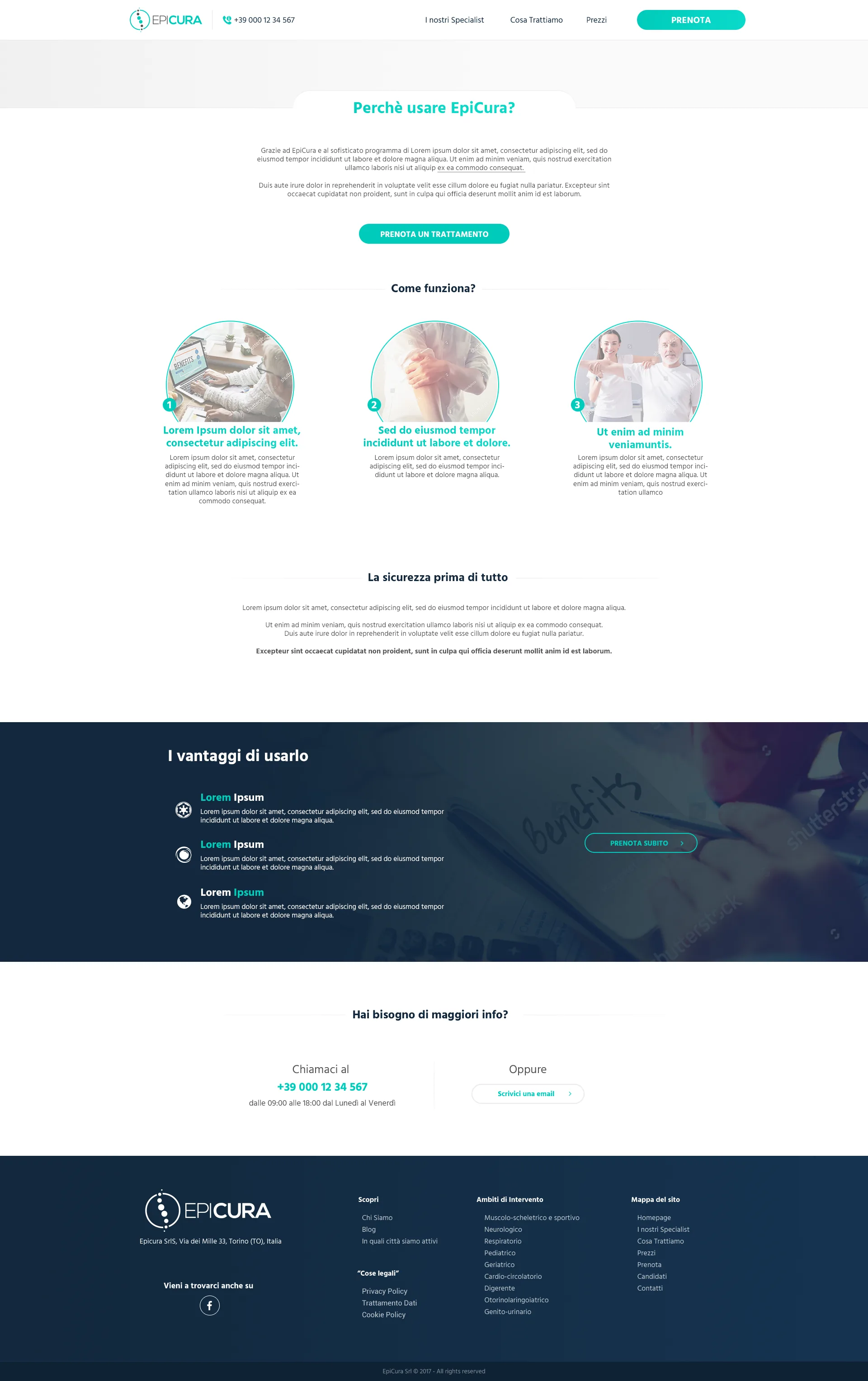
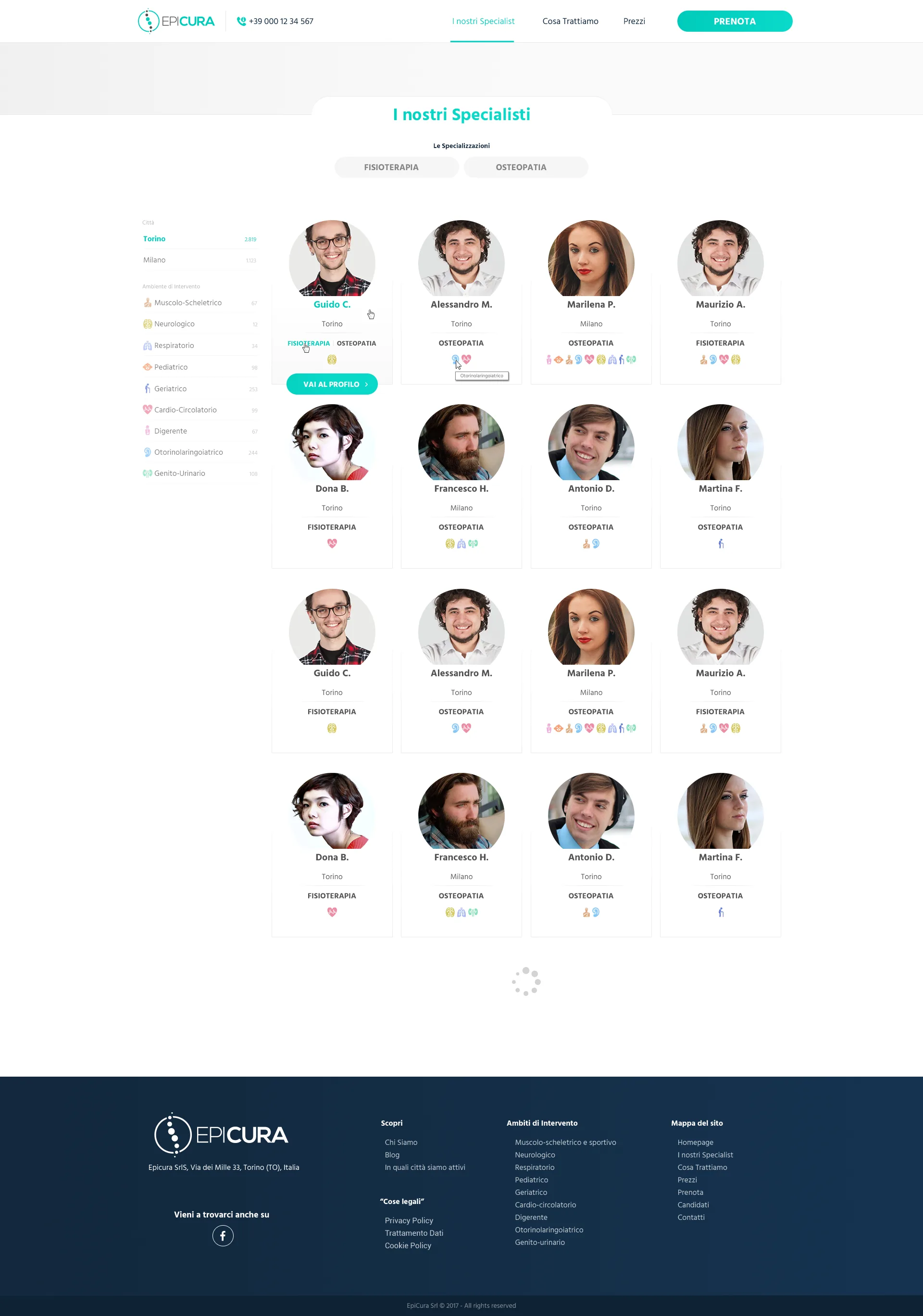
EpiCura’s public site was the first contact. For a healthcare service partly addressed to elderly audiences, it had to solve two things at once: reassure (we’re certified professionals, this is a serious service, it’s safe) and enable (you can book now, in a few clicks, without calling anyone).
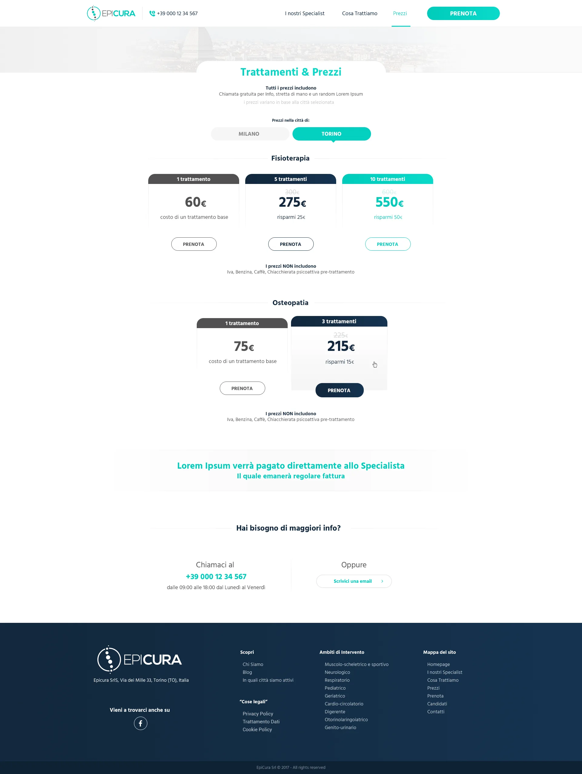
The site was built around a flat structure: a home explaining what EpiCura is, a page per service type, a “How it works” section with three visualized steps, and everywhere a clear CTA toward booking. No editorial blog, no long storytelling, no parallel landing pages. The promise is single: you book, a professional arrives, you pay at the end of the visit.
Going to market, and what came after
With platform and site live, EpiCura entered the market seriously. The first SocialFare/Foundamenta#3 acceleration round brought 105,000 euros from private investors. The professional network grew from five to over fifty in three months, the service extended from Turin to Milan. In the following years came the larger rounds: equity crowdfunding in 2019, a 2-million round in 2020, finally a 5-million Series A in 2021 led by Europ Assistance Italia (Generali Group), with total funding of roughly 8 million euros.
From a home physiotherapy and osteopathy platform, EpiCura became the first Italian digital outpatient clinic, expanding services to medical visits, tele-consultations, long-term care for the elderly. The network today counts over nine hundred professionals in ten Italian cities.
Design wasn’t the only factor in this trajectory. There was service quality, operational execution, market reading. But it was the layer that made the service accessible to its target. For a healthcare product addressed to people who aren’t digital, the interface isn’t an aesthetic layer: it’s a condition of existence.
Numbers
€8M+
Raised by EpiCura
In 4 rounds, 2017–2021
900+
Certified professionals
EpiCura network across 10 Italian cities
3,000+
Families served
Over 31,000 hours of services delivered
Have a similar project?
Let’s talk about the next project.
Performance & Interaction Design Studio. Every client followed personally, from brief to delivery.